http://www.acsu.buffalo.edu/~dbertuca/maps/cat/map-portion-images.html
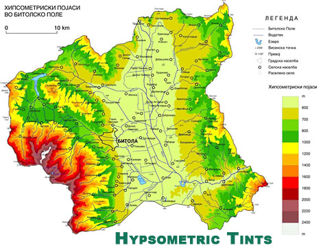
This is a hypsometric map. It uses color to show elevation trends. The writing on the map is in a different language so its hard to know where this is exactly but the pertinent information is all in the shading. Based on the key, we can tell that the left side of the photo, presumably the west part of the geographical area, is the highest in elevation.
No comments:
Post a Comment