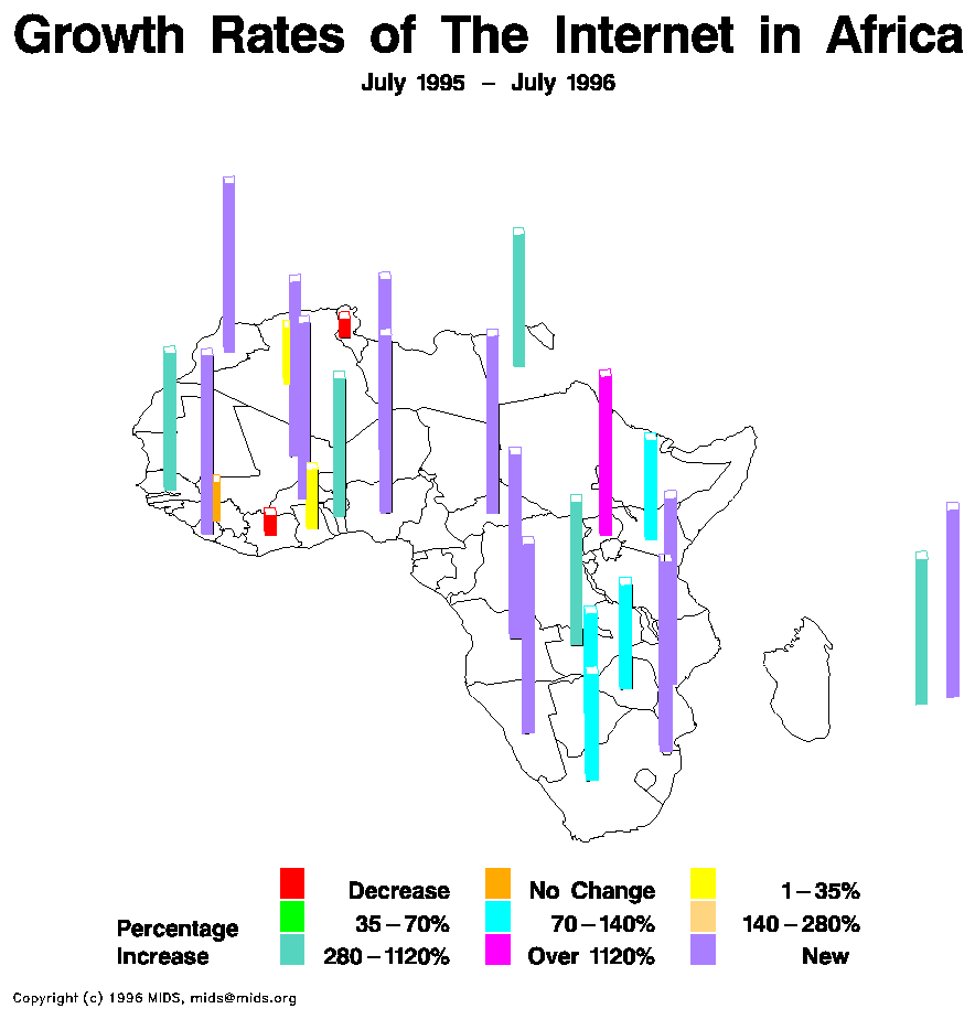
This is a statistical map. Statistical maps are used to indicate variation in quantity of a variable. This map shows the growth rates of internet access in Africa. By observing the map we can see that access to the internet is still relatively new in many parts of Africa as indicated by the lavender colored bars. We can also see that Uganda had a massive growth rate between July 1995 and July 1996.
No comments:
Post a Comment